Despite healthy traffic to the website, an interior design client was struggling with a low conversion rate. So we set up Microsoft Clarity, a user-behavior analytics tool, to help identify where visitors were stalling.
Analysis
Most users were entering the site through the homepage, and heatmap data from Clarity quickly revealed the issue: visitors weren’t navigating beyond it. In fact, the homepage was also the top exit page. Session recordings showed that many visitors clicked through the homepage carousel banner, and then left the site.
Strategy
We came up with 2 solutions:
- Navigation Streamlining – We adjusted the navigation to prioritize the portfolio.
- Calls to Action – We added a call to action button to each slide of the image carousel, guiding visitors to the services and portfolio pages.
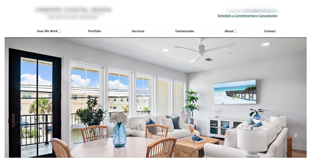
Before
After

Results
Following these adjustments, session recordings showed a noticeable shift. Users were no longer stuck clicking the banner and instead were exploring the website. When compared to the previous year, we saw a 150% increase in potential leads.
By leveraging user behavior analytics, we transformed the user experience from a few clicks through a slider into an engaging journey to conversion.
Results
0%
Increase in YOY conversions